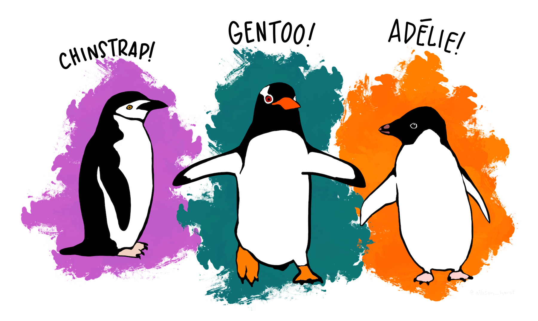
The palmerpenguins package contains data from Antarctic penguins. Its a handy dataset for playing with data visualisation.
load the penguin data
This view of the penguins data gives us a bit of an idea what we are dealing with. Lets play with some other functions below.
penguins
# A tibble: 344 × 8
   species island    bill_length_mm bill_depth_mm flipper_length_mm body_mass_g
   <fct>   <fct>              <dbl>         <dbl>             <int>       <int>
 1 Adelie  Torgersen           39.1          18.7               181        3750
 2 Adelie  Torgersen           39.5          17.4               186        3800
 3 Adelie  Torgersen           40.3          18                 195        3250
 4 Adelie  Torgersen           NA            NA                  NA          NA
 5 Adelie  Torgersen           36.7          19.3               193        3450
 6 Adelie  Torgersen           39.3          20.6               190        3650
 7 Adelie  Torgersen           38.9          17.8               181        3625
 8 Adelie  Torgersen           39.2          19.6               195        4675
 9 Adelie  Torgersen           34.1          18.1               193        3475
10 Adelie  Torgersen           42            20.2               190        4250
# ℹ 334 more rows
# ℹ 2 more variables: sex <fct>, year <int>
get a feel for the data
There are lots of different ways to get a sense of what the data you have just read into R are like. Run the glimpse() code and then try the other options below.
names()
summary()
skim()
Question: Do the penguin species differ in size?
get some descriptives
This table displays the mean, standard deviation, N, and standard error of the penguin body mass variable, separately for each species.
penguin_descriptives %>%ggplot(aes(x = species, y = mean, fill = species)) +geom_col() +geom_errorbar(aes(ymin = mean - std_err, ymax = mean + std_err), linewidth=.3, width=.2) +theme_classic() +labs(y ="Mean body mass (grams)", x ="Penguin species") +scale_y_continuous(expand =c(0,0))
make a better plot
The bar plot above loses all information about the distribution and sample size. Lets plot the raw data.
Run the code below with geom_jitter, and then try geom_violin() and geom_boxplot().
What happens when you add jitter AND violin, or jitter AND boxplot?
PLAY
create some different descriptives and make a bar plot
The code below “pipes” together the process of getting descriptives and making a bar plot.
Choose a variable to group_by (replace species) and a variable to summarise (replace body mass g). Then run the code. The variable names are listed below.